Send Payments
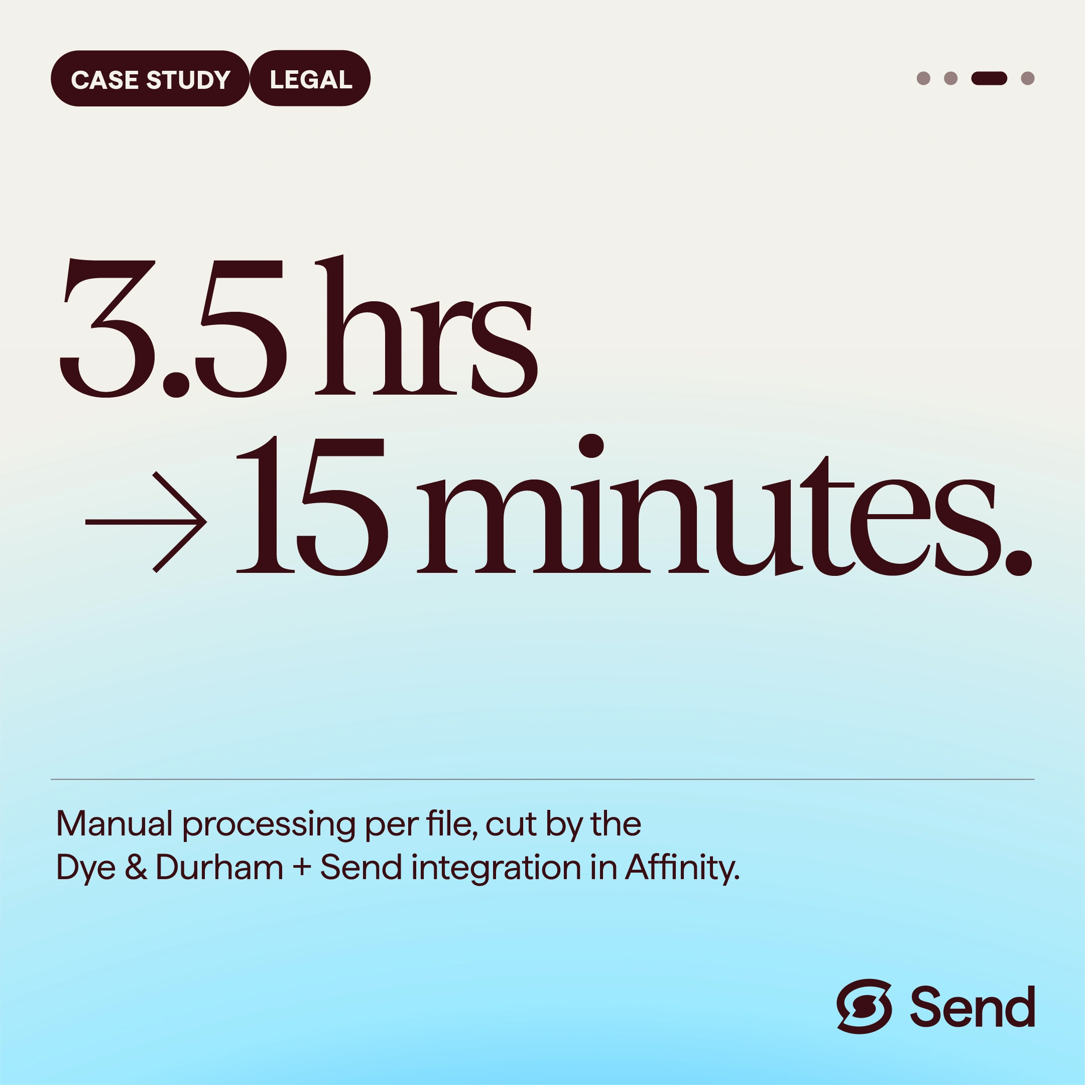
Working with Three Are One, I developed Send Payments’ existing identity into a more complete design and motion system. The work brought together expanded brand guidelines, reusable social templates and animated content, giving the agency and client a consistent set of assets to work with. Send already had an identity and a concise set of guidelines. The brief was to bring more consistency to how the brand appeared across its communications, starting with LinkedIn. I developed the rules around typography, colour and layout, then expanded the guidelines with application examples and direction for imagery and motion. The aim was to make the brand easier to apply across different messages and formats. The social work combined typographic layouts, gradients, illustration and animated graphics. Different treatments gave the content variety while keeping it recognisably Send. Motion helped bring the messages to life without competing with them. Some posts used animated backgrounds beneath readable text; others used short sequences to reveal information in stages. Alongside the finished social assets, I supplied reusable Canva templates and an organised brand asset library. This gave Three Are One and the Send team a practical starting point for creating further content within the system.